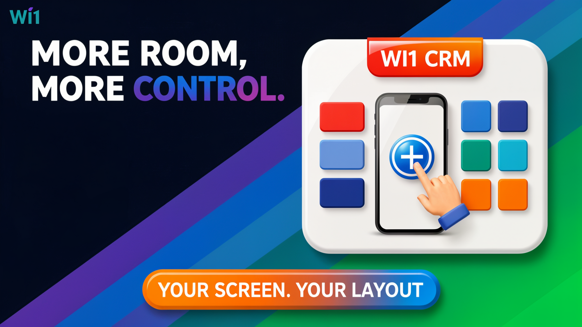
Every week we’re busy making WI1 CRM a bit easier and more pleasant to use — and this week’s update is all about making it nicer to work in on your phone. If you’re an owner or manager who dips in and out of WI1 between meetings, on the shop floor, or on the move, this one’s for you.
A tidier, smarter mobile screen
If you’ve used WI1 on your phone, you’ll know the bottom of the screen had five icons plus a blue “+” button all sitting there at once, taking up space that could otherwise be used to show you more of your actual work — your tasks, your kanban board, your customer details.
We’ve changed how that blue button behaves. Instead of just adding something, it now acts as a toggle: tap it, and the app shows you the buttons that are actually useful for the page you’re looking at right now. Tap it again to tuck them away and get that screen space back.
So on your kanban board, tapping the button reveals options for creating a new task and filtering your board. On another screen, you’ll see whatever’s relevant there instead. The result is a cleaner, less cluttered screen most of the time, with the right shortcuts only a tap away when you need them.
How this helps day-to-day
If you’re managing a small team from your phone between jobs, this means less scrolling and squinting at a busy toolbar, and more room to actually see your board, your list, or your customer record. For example, if you’re checking your kanban board while grabbing a coffee, you can glance at the full picture first, then tap the toggle only when you’re ready to add a new task or narrow down what you’re looking at with a filter.
It’s a small change, but it’s the kind of thing that makes using WI1 on the go feel less fiddly and more like the desktop experience you’re used to.
As always, if you’ve got thoughts on what would make WI1 easier to use, let us know — updates like this one often start with feedback from people using the system every day.